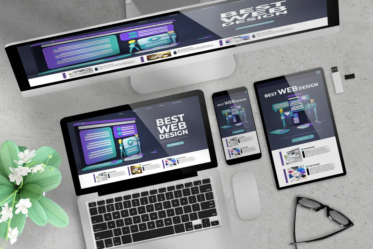
Your website gets visitors, but they leave without calling, buying, or filling in the form. It is tempting to blame traffic, but the real problem is usually the site itself. A pretty website that does not convert is an expensive brochure. The features that turn visitors into customers are well understood, and most sites are missing several of them.
Key Takeaways
- A website's job is to convert, not just to look good; design and conversion are not the same thing.
- Slow load times are one of the biggest silent killers of conversions.
- A clear, single call to action beats a page cluttered with competing choices.
- Trust signals, reviews, guarantees, and real proof, turn hesitation into action.
- Most web traffic is now mobile, so a mobile-first layout is non-negotiable.
- Copy that speaks to the customer's problem converts better than copy that lists your features.
- Small, deliberate changes to these features often lift conversions more than a full redesign.
What Are Website Features That Convert? Unpacking the Myths
Website features that convert are the specific elements, speed, clear calls to action, trust signals, strong copy, and frictionless forms, that move a visitor from browsing to acting. The myth is that a beautiful design automatically converts. Looks earn attention, but conversion comes from clarity, trust, and removing friction. A stunning site that hides its phone number and loads slowly will lose to a plainer one that makes acting effortless.
The Difference Between a Pretty Site and a Converting Site
A pretty site impresses. A converting site persuades and then makes the next step obvious. One wins compliments; the other wins customers. Since you are paying for the site either way, which result would you rather have? That gap is exactly what conversion-focused web development is built to close.
Key Features That Turn Visitors Into Customers
The essentials are fast load times, a single clear call to action per page, visible trust signals, benefit-led copy, and short forms. Get these working together and every visitor meets fewer reasons to leave. So why do so many sites still miss them? A few stubborn myths.
Common Misconceptions: The Truth Behind Website Conversion
The most common false belief is that more traffic is the answer to weak results. Often the traffic is fine; the site simply is not built to convert it.
Quality Concerns: Isn't a Beautiful Design Enough?
No. Design draws people in, but conversion depends on clarity and trust. A visitor who cannot instantly tell what you do, why you are credible, and what to do next will leave no matter how polished the visuals are. Beauty opens the door; the features above walk the visitor through it, which is why we cover it in why your website isn't converting.
Trust Concerns: What to Look For on a High-Converting Page
Before you judge your site, check for these three things:
- A single, obvious call to action that stands out above the fold.
- Genuine trust signals, reviews, results, guarantees, near the decision point.
- Copy that names the visitor's problem before it lists your features.
Standards Comparison: A Brochure Site vs a Conversion Machine
A brochure site describes your business and stops. A conversion machine guides each visitor toward one action and removes every reason to hesitate. The reassuring part? You rarely need a full rebuild; targeted changes to these features usually move the numbers.
The Financial Impact: Real Conversions and Returns
Why does this matter so much? Because your conversion rate decides how much revenue the same traffic produces. Consider the numbers:
- A large share of visitors abandon pages that take more than a few seconds to load, so speed alone can swing conversions.
- Since most traffic is mobile, a layout that fails on phones quietly loses the majority of your audience.
- Because conversion improvements multiply the value of every visitor you already have, they often out-earn spending more on ads.
Doubling your conversion rate is like doubling your traffic, except you pay nothing extra for the visitors.
Your Next Move
Sharpen your most important page this week:
- Test its load speed and fix whatever is slowing it down.
- Cut it to one clear call to action.
- Add a real review or result near that call to action.
Building and Maintaining a Converting Website: What You Need to Know
Say you are ready to make your site earn its keep. The work is part build and part ongoing refinement based on how real visitors behave. Here is how to approach both, and how to spot a site that is leaking customers.
Getting the Build Right
You can improve a lot yourself, but a partner builds conversion in from the ground up. Why bring in help?
- Conversion design balances speed, clarity, and persuasion at once, which is hard to juggle alone.
- A professional builds on a fast, sound foundation through proper web development, so performance never undercuts the message.
- A partner tests and refines based on data rather than guesswork, tying the site into your wider marketing.
Warning Signs Your Website Is Costing You Customers
Watch for these red flags:
- Visitors arrive but rarely call, buy, or submit a form.
- Pages load slowly, especially on mobile.
- Multiple competing buttons pull attention in different directions.
- No reviews, guarantees, or proof anywhere near the decision point.
Your Ongoing Conversion Checklist
Keep your site converting as it grows:
- Monitor load speed and fix regressions.
- Keep one clear call to action per page.
- Refresh trust signals with new reviews and results.
- Review your forms and remove any unnecessary fields.
Do this and your website stops being a brochure and starts being your hardest-working salesperson. Explore our web development service or book a free strategy call.